Mondial Sali

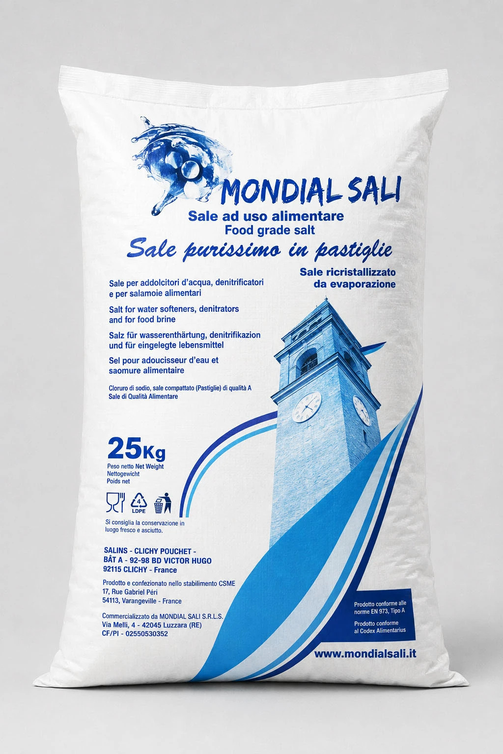
25 kg Industrial Packaging

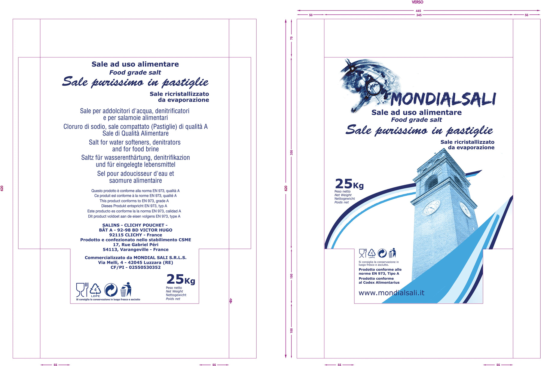
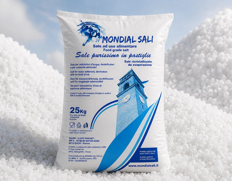
The visual identity was adapted to the 25 kg professional format, balancing technical information, product recognition and consistency across the entire range.

The project was developed around the client’s request for a strong and distinctive identity.

The image of a bell tower in Sarzana was introduced as a recognizable element linked to the territory, giving the packaging a unique and memorable character.

Mondial Sali — Identità e contesto aziendale
Mondial Sali — Packaging da 25 kg
Mondial Sali — Sviluppo grafico ed esecutivi
Mondial Sali — Applicazione del brand al prodotto

Corporate Communication & Client Materials

The visual identity was extended to corporate and promotional materials designed to strengthen brand recognition beyond product packaging. A custom ring binder was developed as a practical client gift and working tool, translating the Mondial Sali visual language into an everyday object.

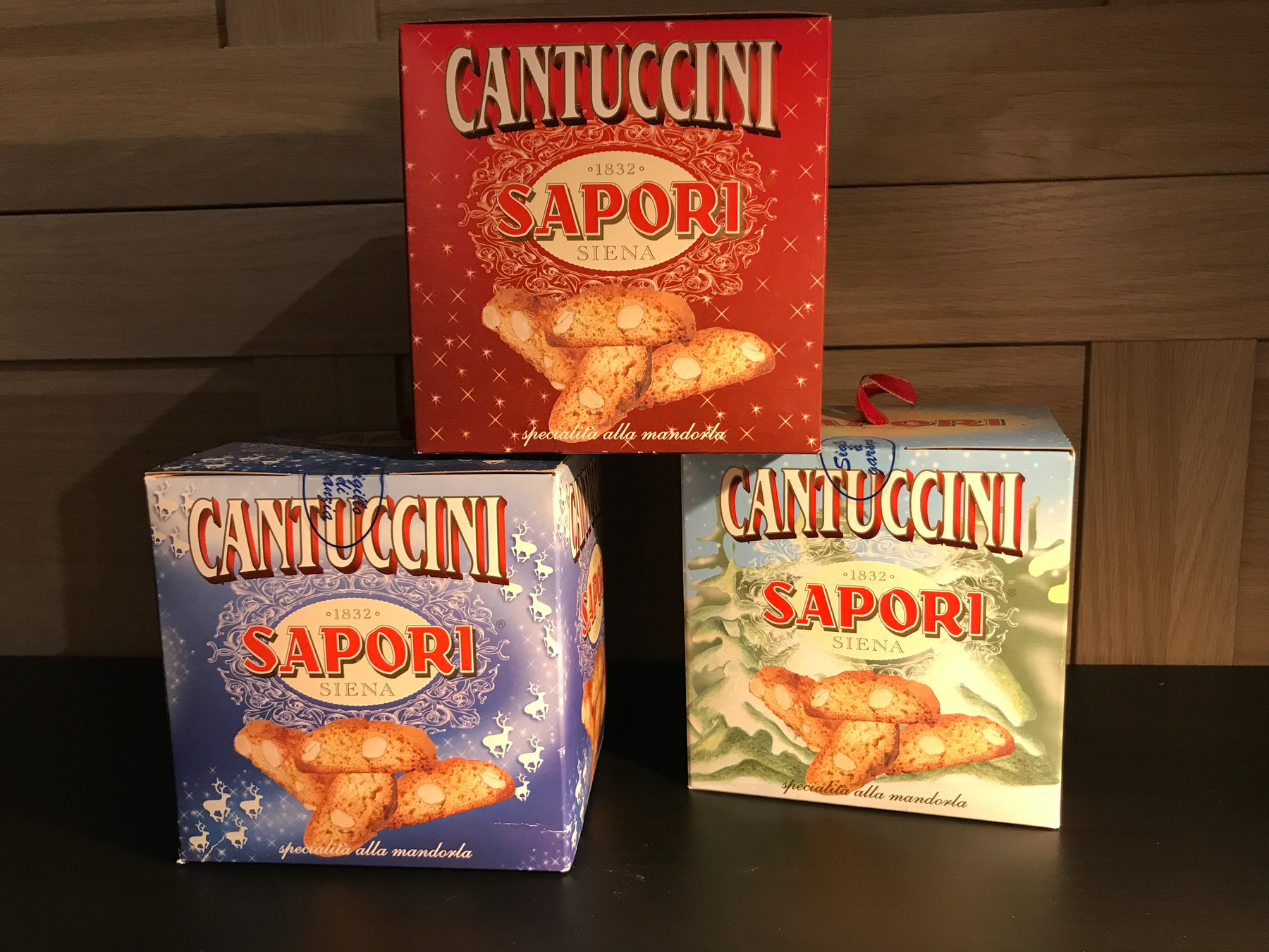
Sapori Siena

Cantuccini Packaging – Christmas Edition

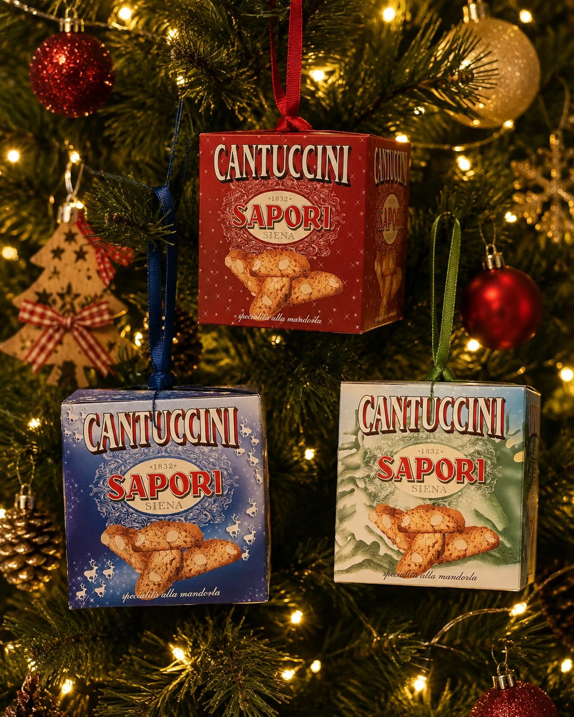
A Christmas packaging concept designed to transform Sapori Cantuccini into a true Christmas gift, combining tradition, product appeal and the festive atmosphere of the holiday season.

The graphic design combines hand-drawn illustrations with product photography, creating a warm and distinctive visual language. The illustrations build a Christmas narrative around the pack, while the photography provides an immediate connection with the Cantuccini and highlights their traditional, artisanal character.

The structure itself is conceived as gift packaging: not simply a container, but a decorative pack designed to be chosen, given as a gift and displayed on the table during the Christmas season.

Different colour variations create a coordinated Christmas collection, while maintaining a strong and instantly recognisable Sapori brand identity.

Brand Identity + Packaging Design: studio di naming e loghi.

Sapori Siena — Identità Sapori
Sapori Siena — Collezione di packaging natalizio
Sapori Siena — Packaging — Christmas Edition

EVOCAT

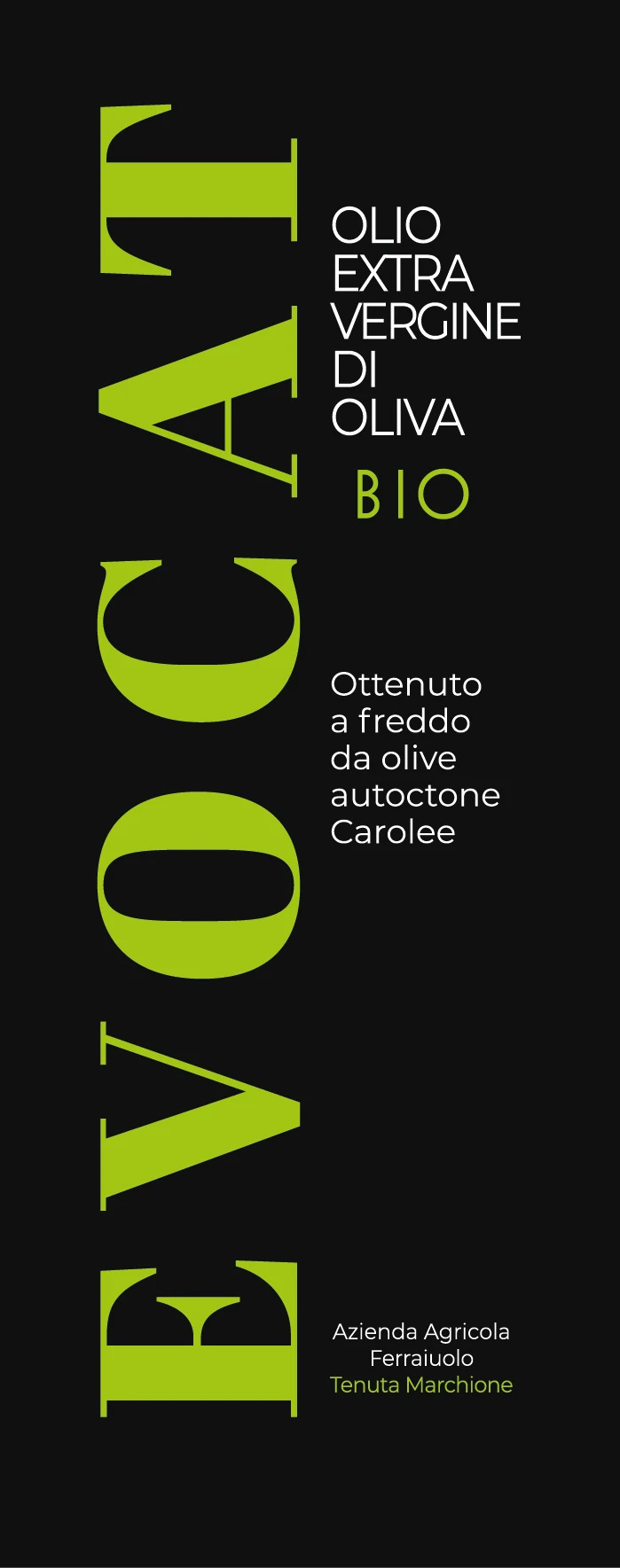
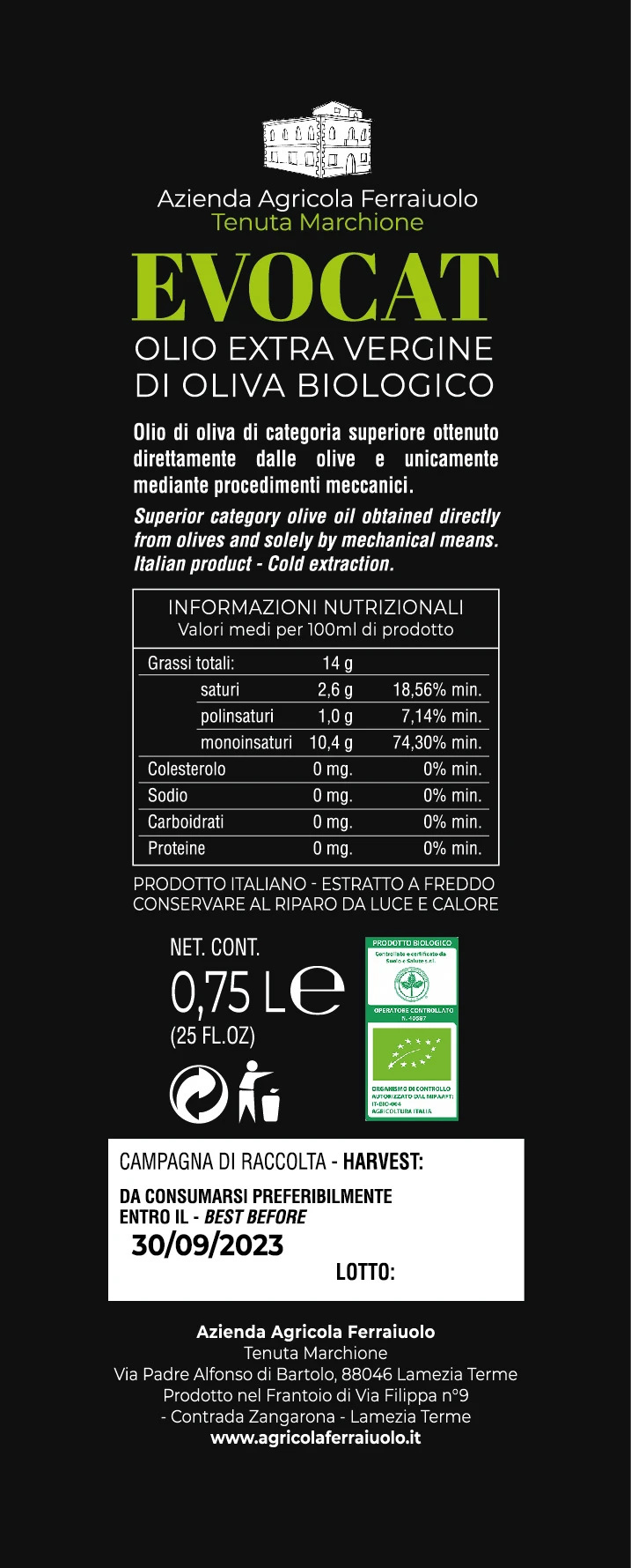
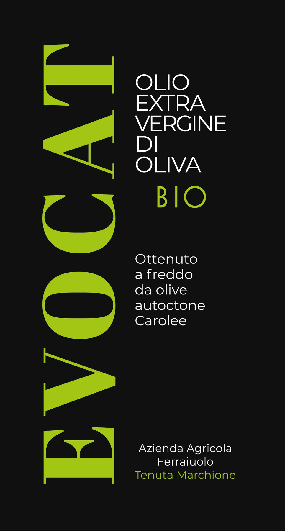
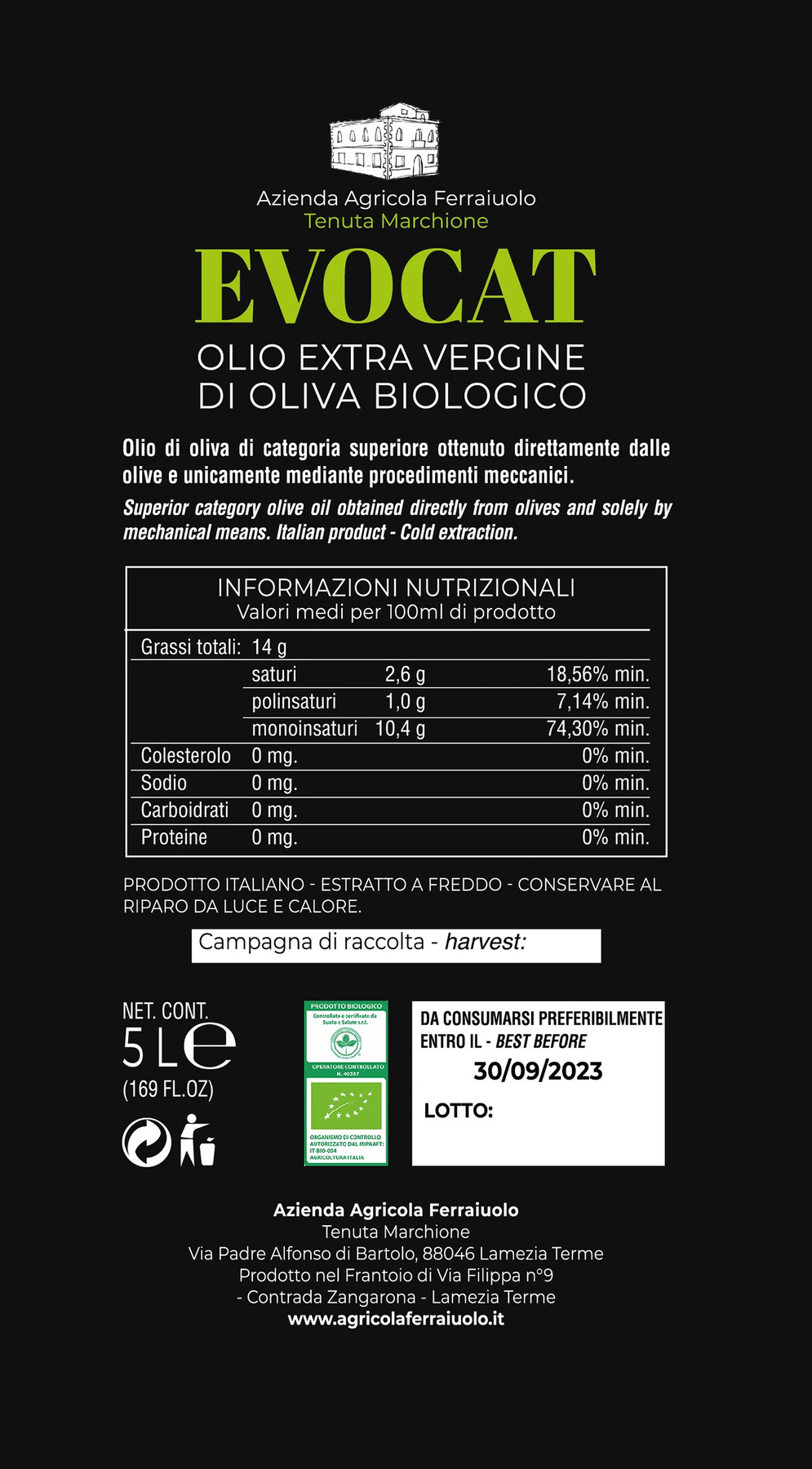
EVOCAT — Organic Extra Virgin Olive Oil Packaging

Visual Identity & Packaging for an Italian Organic Extra Virgin Olive Oil

EVOCAT is an organic extra virgin olive oil produced by Azienda Agricola Ferraiuolo – Tenuta Marchione, in Calabria, Italy.

The project focused on creating a distinctive visual identity and packaging system capable of communicating the agricultural origin of the product while giving the brand a contemporary and recognizable presence.

The identity was developed across different packaging formats, from the 750 ml glass bottles to the 5 L olive oil tin, maintaining a consistent visual language throughout the range.

EVOCAT — Identità del brand
EVOCAT — Etichetta frontale — bottiglia
EVOCAT — Etichetta posteriore — bottiglia
EVOCAT — Etichetta frontale — latta
EVOCAT — Etichetta posteriore — latta

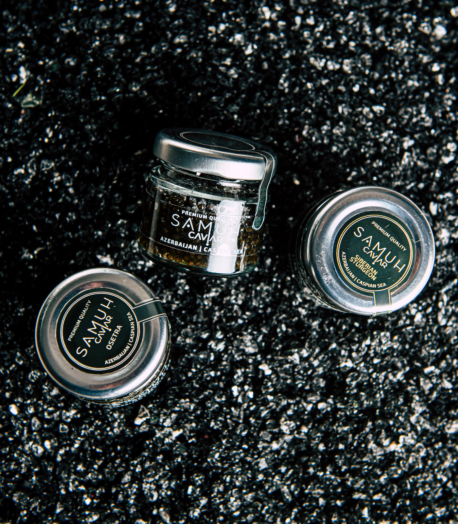
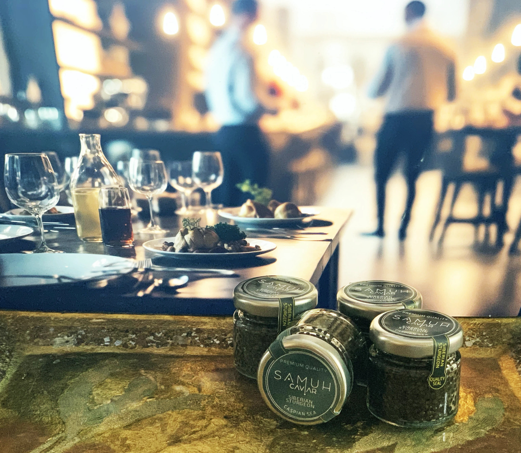
Samuh Caviar

Samuh Caviar — A Premium Caviar Brand from the Caspian Sea, Azerbaijan

Samuh Caviar è un progetto di comunicazione visiva dedicato a un brand food di alta gamma.

L’obiettivo era costruire un’identità elegante e riconoscibile, capace di esprimere qualità, raffinatezza e attenzione al dettaglio attraverso branding, packaging e presenza digitale.

Samuh Caviar — Identità del brand
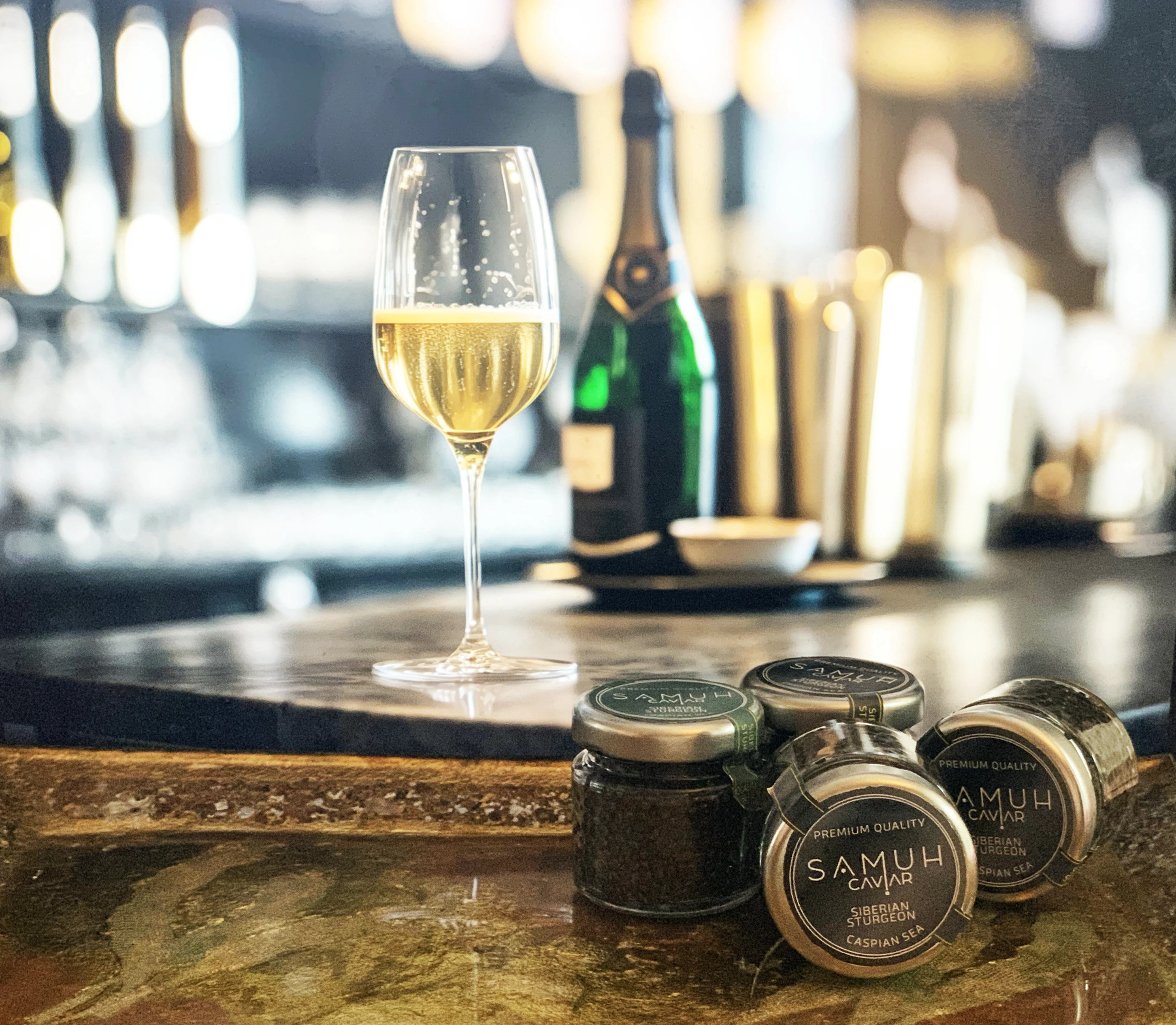
Samuh Caviar — Packaging nel contesto del prodotto
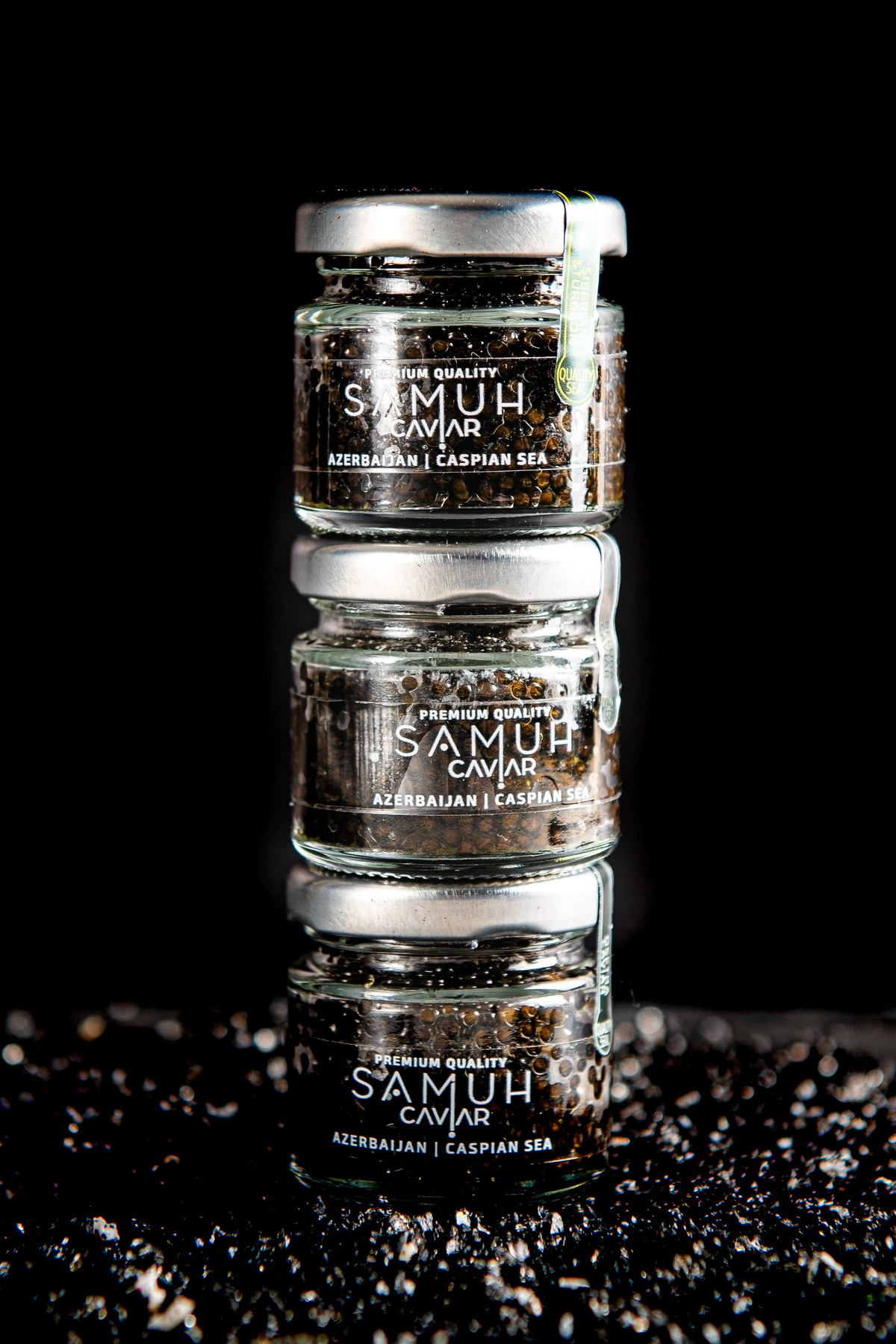
Samuh Caviar — Linea di packaging
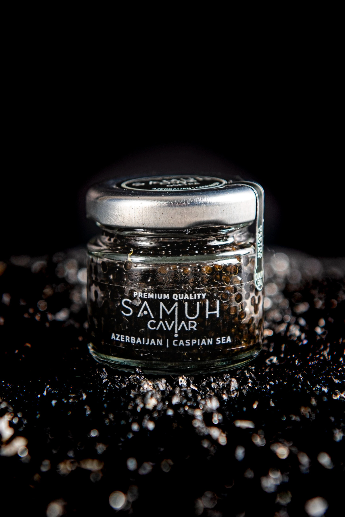
Samuh Caviar — Dettaglio della confezione
Samuh Caviar — Packaging e identità
Samuh Caviar — Immagine del prodotto
Studio Costa

Milano & Oltre

Stefania Costa

Art Director · Branding · Visual Communication

scosta@studiocostaadv.it
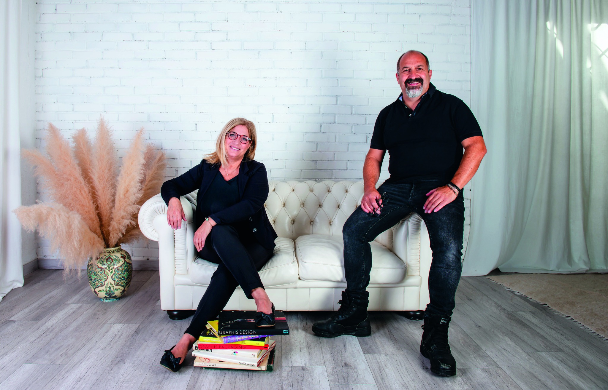
Stefania e Massimiliano Costa

Massimiliano Costa

Fotografo · Grafico

mcosta@studiocostaadv.it massimilianocostafoto.com

© 2026 Studio Costa